

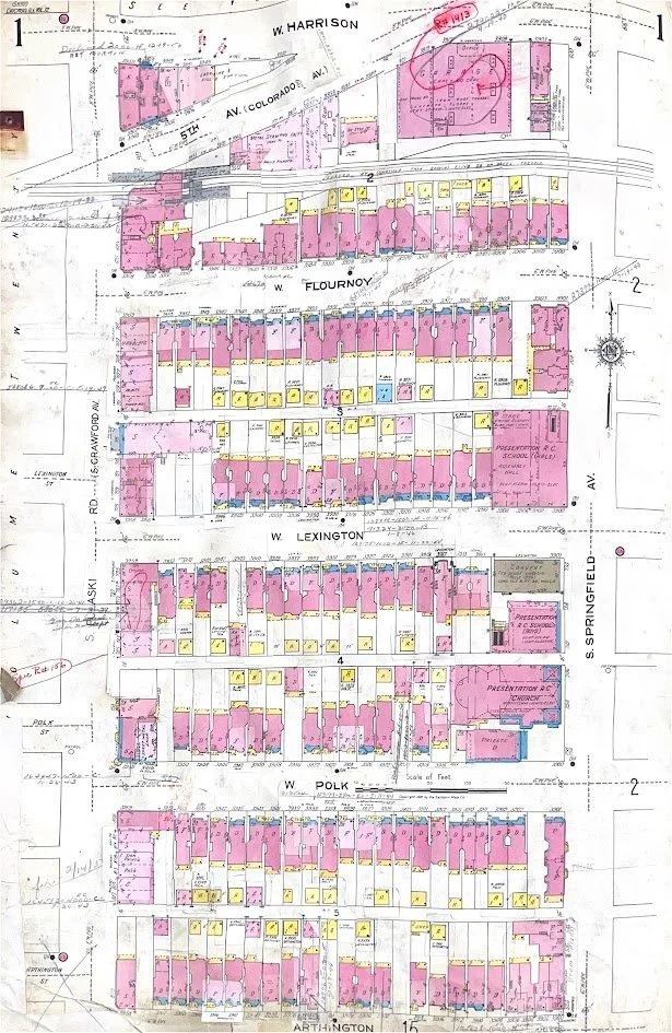
1896-1922
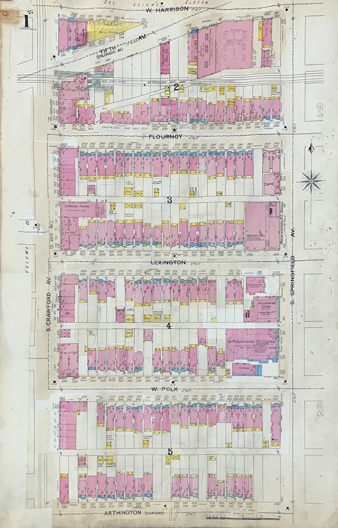
1923-1956
Select a cardinal direction to navigate to nearby pages
Why does one map have a date range?
To save money, this map was continuously updated by hand after its initial print in the form of patches the publishers would send out to be glued into place. If you look closely you can see where some parts of the paper have a different color or texture, indicating a change has been made. This means that for the map on the left, for instance, the base map is an accurate representation of the structures on these blocks in 1896. The map with all its patches represent the blocks in 1922. There were hundreds of revisions made to both of these maps between their publishing date and the date of their final update, so we don’t really have a good way of knowing when specific changes were made outside the range provided.
What do the colors mean?
This map was used primarily for assessing fire risk, so the colors correspond to primary building material.
Brown: Fire-proof materials
Blue: Concrete or Stone
Pink: Brick Masonry
Yellow: Wood Frame
Other details are written out, like the number of floors and the primary function.
Why is the map so lumpy?
These maps were scanned from very old books about the size of a school-desk each with the youngest one being printed over a hundred years ago. In that time the books have formed ridges in the paper due to a variety of time-related factors. This is only exasperated by the thousands of patches that have been glued in, leading to the paper to buckle further. When scanning, we cannot risk damaging the fragile spines by flattening the pages, so the lumpy texture remains in our images.